How Rado Translated Le Corbusier’s Structural Colour Theory into a Trio of High-Tech Ceramic Icons
.jpg)

Le Corbusier once remarked that colour is “an instrument as powerful as the plan”. To the Swiss-born modernist, a palette was a structural necessity capable of defining volume and directing the eye. His Polychromie Architecturale—a systemic 63-shade library developed in 1931 and expanded in 1959—was designed to offer architects a naturally harmonious keyboard of tones. It was a rejection of the arbitrary, a belief that colour should be as engineered as the reinforced concrete it adorned. Now, in a collaboration with Les Couleurs Suisse®, Rado has shrunk that architectural rigour down to a 40mm monobloc canvas.
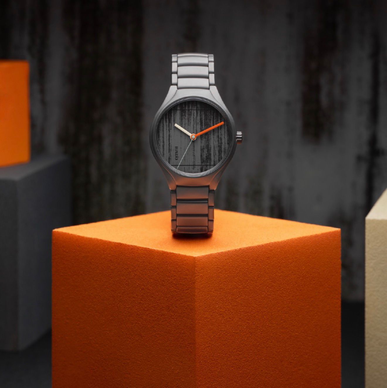
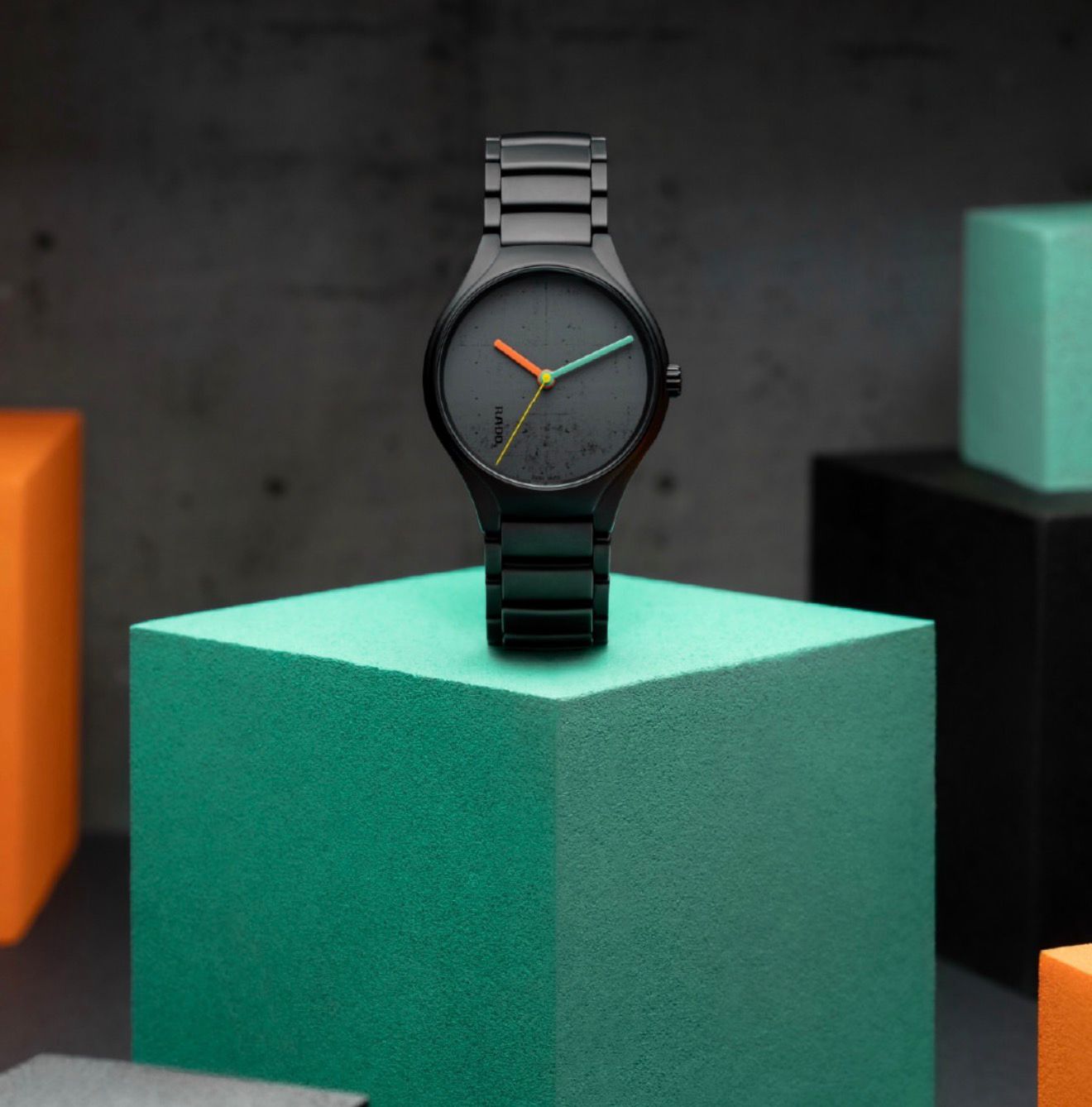
Unveiled at the India Art Fair 2026 in New Delhi, the collection includes three new watches in distinct colours, moving beyond the typical brand-designer crossover. Instead, it functions as a material study of three specific Le Corbusier projects: A watch in Ivory White to pay tribute to La Cité Radieuse in Marseille, Iron Grey to represent the Carpenter Center at Harvard, and the third in Ivory Black as an homage to the Palace of Assembly in Chandigarh.
Béton-brut
The technical interest here is the dial. Rado has bypassed the standard brass base in favour of laser-engraved high-tech ceramic. The result is a miniature reproduction of béton-brut—the rough-cast, board-formed concrete texture that defined the Brutalist movement. It is a subtle execution that rewards a loupe. To ensure the composition remains balanced, the hands are lacquered in contrasting shades from the palette: the Marseille edition features a trio of Sky and Ultramarine blues; the Cambridge piece uses Cream White, Powerful Orange, and English Green; and the Chandigarh model pops with Orange, Emerald, and Olive Green against its dark backdrop.
.jpeg)
Polychromatic excellence
Achieving an exacting shade in a monobloc ceramic case requires a precise sintering process at 1,450°C. In ceramic engineering, maintaining a consistent ivory white across different components is notoriously difficult, but Rado’s experts have matched the case and bracelet to the exact Corbusian colour code. Each reference is powered by the R763 automatic movement with an 80-hour power reserve, although the real enthusiast detail sits on the caseback—a digital print of the full 63-colour spectrum encircling the sapphire crystal, offering a view of the oscillating weight through the architect’s own signature. A workhorse of Swiss reliability, the movement also features a Nivachron™ hairspring and the water resistance is measured at 50 metres.
At the Rado showcase within the India Art Fair VIP Lounge, the pieces were presented as a study in total design. Amidst the contemporary installations of the IAF, the collection acted like a conduit between mid-century Swiss theory and modern-day material science, a tribute to the idea that a well-executed plan, regardless of scale, remains permanent. To unpack the ideas behind the collection, GMT India sat down with Rado CEO Adrian Bosshard. Excerpts from the interview below:
GMT India: Why is Le Corbusier’s colour philosophy still relevant to watchmaking in 2026?
Adrian Bosshard (AB): Le Corbusier remains the guru for architects because he pushed boundaries when others were scared to innovate. Our collaboration with the Foundation Le Corbusier inspires our team to look beyond today’s trends. A watch is not just an object that tells time, it is an artwork and a statement. His creative spirit helps us create something different from a regular round steel watch.
GMT India: How does the True Round silhouette serve as a canvas for architectural ideas?
AB: This year, we selected three buildings—in Cambridge, Marseille, and Chandigarh—as inspiration. We developed high-tech ceramic colours in ivory white, grey, and black to match these structures. We didn't limit the ceramic to the bracelet; the dials are also ceramic, laser-engraved with the texture of each building's façade. These pieces are 40% lighter than steel, fully scratch-resistant, and represent a unique link between architecture and our material expertise.
GMT India: What was the technical challenge of achieving the specific ivory white shade?
AB: The challenge is the sintering process. We must find the right raw material mixture and then adapt the oven temperature—roughly 1,500°C—to ensure the thickness of the case matches the bracelet elements 100%. Every colour must be approved by the Foundation to match Le Corbusier’s specific colour codes. Furthermore, our plasma ceramic is heated to over 20,000°C—four times the sun's temperature—to achieve its unique finish.
GMT India: How do you reconcile the béton-brut (raw concrete) texture with Rado’s refined tactility?
AB: We chose to use ceramic dials rather than painted brass to maintain authenticity. Both concrete and high-tech ceramic are hard, raw materials. Engraving the building’s structure directly into the ceramic creates a look and feel that standard materials couldn’t achieve. Combined with double-sided anti-reflective sapphire glass, the individuality of the structure is clearly visible.
Image credits: Respective brands


.png)